Last spring I got an email from Harriet Power, who did such a good job copyediting my typo-ridden book. She asked if I’d be willing to write about textbook design for the Chartered Institute of Editing and Proofreading blog, which she coordinates and edits.
I immediately said yes, I would. Then I begged for a series of extensions. A few weeks ago, I finally turned in my piece, Harriet offered a few suggestions, and it appeared on the CIEP blog. Go check it out!
The piece, which I’m also running below, is an attempt to apply the ideas that I used in Teaching Math With Examples to textbook design. This isn’t radically reimagining the textbook, or recommending anything drastic and…I feel a little bad about that? Shouldn’t I be imagining the future of learning instead of tweaking textbook design?
Well, maybe. But I think there’s also value in taking small steps forward. In fact let’s say that’s my grand vision for education—that we keep making tiny improvements until we’re doing all the things we do, but much better. That probably won’t spark a movement, but feh! Who needs movements?
Creating textbooks that help students learn
I recently opened the latest edition of a college-level meteorology textbook. Each page, I happily discovered, was colourful and bright. Tricky details from the text were illustrated with well-selected images. Boxes were offset from the main text to expand on interesting points. It felt warm and vibrant, so I read on.
A few minutes later, I was overwhelmed. While each individual sentence went down fine, the cumulative effect wore on me. There was an example I couldn’t make sense of, and then a whole section that as a student I might not have understood at all. It left me wondering, is there a better way to design these things?
I wish I could tell you that there’s a science of textbook design. As far as I can tell, there is not. What we have instead is psychological research that can help us think more clearly about design choices. That is, there is an art of research-informed textbook design.
Here are two recommendations that I think would most improve most instructional texts:
Ask more questions, more often
Structure ideas into manageable chunks
These ideas both emerge not just from experience, but also from research on teaching and learning.
Recommendation 1: Ask more questions, more often
From a pedagogical perspective, studying a text is somewhat akin to learning from a lecture, video or explanation. In other words, it is a form of direct instruction. All that’s missing is a teacher.
One common problem of direct instruction is that it can leave students not thinking deeply enough about the content. What happens instead could be called surface-level comprehension, or even shallow information processing. Classroom teachers are familiar with this – students nod along, seem interested enough, but hardly remember a single thing the next day. How do we avoid this when we ask students to learn from texts?
The answer, in short, is urging the reader to think more deeply. In the area of research I’m most familiar with – worked example research in mathematics – a three-stage structure has emerged1 for encouraging students to learn from presented examples:
Provide the information. First, information is presented to students. In a book, this is the main text.
Prompt for explanations. Students are prompted to think more deeply about the information. These don’t need to be open-ended explanation questions – they could be multiple-choice or fill-in-the-blank questions woven into the main text, or even in the margins.
Ask for application. Students apply their knowledge in a new, but similar, situation.
The practice questions that appear at the end of a textbook chapter play this role, but research suggests there are benefits for also asking questions closer to the information being presented. Questions should be presented more frequently, closer to the relevant material.
How frequently? Hard to say. Too few questions, and students might fail to make important connections. Too many and the text becomes difficult to read. But most texts, it seems to me, ask too few.
Recommendation 2: Structure ideas into manageable chunks
In 2003, researchers Richard E. Mayer and Roxana Moreno published ‘Nine Ways to Reduce Cognitive Load in Multimedia Learning’. Try remembering a seven-digit number while also reading Twelfth Night. You’ll likely feel overwhelmed: that’s too much ‘cognitive load’, and it harms your thinking and learning.
Textbooks often trigger cognitive overload in their readers. Many new concepts are just hard to take in. But often, the overload can be managed by delivering the new idea in smaller chunks while following research-based design principles.
Mayer and Moreno’s paper is worthwhile reading for anyone in the business of designing learning materials of any sort. Here are four techniques they mention that I find particularly relevant for improving textbooks:
Cut stuff. When ideas are challenging, ruthlessly exclude information that doesn’t pertain to the content; even interesting facts, trivia or tidbits can contribute to cognitive overload. Another common issue is redundant text.
Preview the structure. If a process is complex, structure it for students. Break it into little chunks and name each one. Then dive into the details.
Segment complexity. If an explanation or a process is long, consider chunking it up and explaining each chunk individually.
Aligning. When illustrations or examples appear on another page (or another website, for digital texts), the student must remember information from the main text to learn what is intended. This is a memory burden that can contribute to overload – better to align text with illustrations and diagrams, to whatever extent possible.
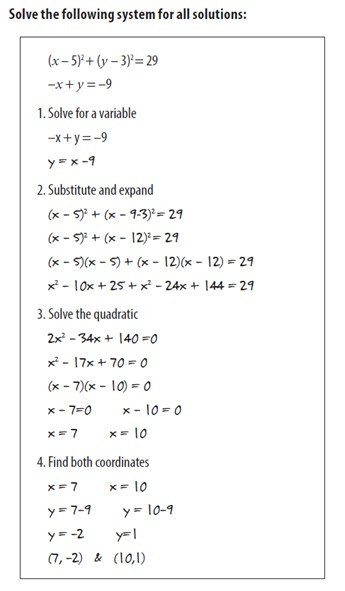
In a mathematical situation, an example of what not to do would be to present something like this lengthy example2 with a picture of a skateboarder nearby, describing a context in which he might want to know how to solve a system. (This isn’t far off from common textbook practices!)
A better way to handle this would be to first preview the structure, mapping the terrain of the forest before describing each tree. This means articulating to students the shape of events prior to a more thorough explanation. ‘The period leading up to World War II was characterised by (1) aftershocks from World War I, (2) the rise of fascism and (3) war in Asia,’ we might say, before diving into greater detail.
Then we should segment the explanation so that each sub-step or component is clearly labelled. In other words, we should connect the details with the structure that we have previewed.
Here is what it might look like in a mathematical case:
Applying knowledge
We can end with an exercise. Find a textbook that has a difficult passage. It might be an example intended to illustrate the concept of ‘opportunity cost’. It may be a description of how various elements move through the layers of the atmosphere. Every textbook has parts where multiple ideas need to be juggled by the reader.
Once you’ve found a tricky passage, try to identify its component parts. It likely has somewhere between two and four sub-steps, each of which might be teachable on its own.
Write an explanation or example that conforms to this structure. Think about how you could preview the structure for the reader.
Finally, write a question or two that students could use to check their understanding of the passage. Make it quick, so as not to interrupt the flow of the text too badly.
Maybe it shows a line of poetry and asks, ‘True or false: this poem shows iambic pentameter.’
It could also be good to prompt students to make connections and explanations: ‘Which choice below best explains why prices dropped when there was a production surplus?’
These are not the way great novels or non-fiction texts are typically written, but that’s just fine. A textbook can’t be a great book – it needs to be a great teacher. We should look towards teaching research for inspiration on how to design excellent, learnable texts.
Booth, JL, Oyer, MH, Paré-Blagoev, EJ, Elliot, AJ, Barbieri, C, Augustine, A and Koedinger, KR (2015). Learning algebra by example in real-world classrooms. Journal of Research on Educational Effectiveness, 8/4: 530–551.
The two mathematical examples in this post are taken from my book Teaching Math with Examples (John Catt, 2021); this book goes into more detail about how to design and present maths examples that work.


I read a previous post of yours a week ago which made me mildly curious, but this was awesome (we don’t use that term much in the UK, so I mean it very positively). I’ve written over 20 revision guides and this has made me rethink. I’d love to show you one to get some feedback, but either way, this post will continue to help me. Thanks!
Good thought provoking post. Just bought your book and looking forward to diving into it over break.